Colorful Quiet Luxury Palettes: A Timeless Checklist
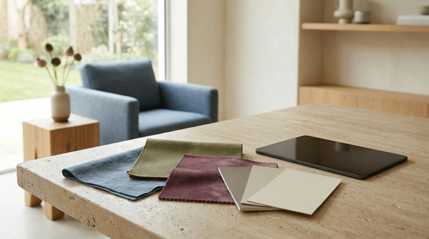
Quiet luxury doesn’t require a room—or a design—to be beige from top to bottom. It’s a thoughtful approach to color: choose shades you enjoy, give them room to breathe, and let contrast do its work without making every element compete for attention.
Our approach starts with a simple question: how do you want the finished space or design to feel? From there, a digital checklist can help you explore elegant palettes with minimalist appeal, whether you’re drawn to earthy olive, dusty blue, or a richer shade of plum.
What Makes a Color Palette Feel Quietly Luxurious?
A quietly luxurious palette feels cohesive rather than monotonous. Its colors have a relationship: perhaps they share a muted quality, sit comfortably beside a warm neutral, or repeat in considered accents. Subtle contrast gives the eye places to rest and places to linger.
Color can bring personality to that calm foundation. Muted blue can feel composed, olive green can add an organic note, and rust can make a neutral scheme feel warmer. Soft plum offers depth without demanding the attention a more saturated purple might. The key is not to avoid color, but to decide how prominently each shade should appear.
Timelessness also comes from choosing colors that suit your taste and setting, rather than adopting every passing trend. A fashionable shade may work beautifully if you love it, but it doesn’t need to lead your palette just because it’s popular.
Build a Palette Around Color You Love
Begin with one favorite color, then look for a grounding neutral and a supporting shade. If you love dusty blue, for example, warm gray can soften its coolness while deep navy adds definition. If terracotta is your starting point, cream and muted brown can create a warm, layered effect.
Use these combinations as starting points, not fixed formulas. You can make a shade lighter, deeper, warmer, or less saturated to suit the setting. You can also change the proportions: a little plum against a generous amount of stone creates a different mood from a plum-dominant scheme.
| Color direction | Grounding neutral | Supporting shade | Overall mood |
|---|---|---|---|
| Muted olive | Warm ivory | Soft taupe | Natural and calm |
| Dusty blue | Warm gray | Deep navy | Cool and composed |
| Terracotta | Cream | Muted brown | Warm and welcoming |
| Soft plum | Stone | Charcoal | Subtle and refined |
Before committing to a larger design, gather swatches or samples and view them side by side. A color that looks subdued alone may feel surprisingly strong next to a pale neutral. Josef Albers’s Interaction of Color explores how colors can appear to change depending on their surroundings—a useful reminder to assess the combination, not just each individual shade.
Use the Checklist to Refine Your Choices
Our Colorful Quiet Luxury Palettes Checklist is a digital download guide for exploring elegant color schemes, minimalist style, and timeless design inspiration. It’s listed at $37.99.
As you compare potential combinations, use a checklist approach to ask yourself:
- Balance: Does one shade provide a calm foundation, or are all the colors competing for attention?
- Contrast: Can you distinguish the elements you want to stand out?
- Consistency: Do the shades feel related across the pieces you plan to use together?
- Personal appeal: Do you enjoy the palette beyond its immediate novelty?
Return to your choices after seeing them in context. Place material samples together in the room, or view digital colors alongside the typography and images they’ll accompany. Adjusting one supporting shade can make the whole palette feel more settled.
If you’re planning a small business project alongside a visual refresh, our From Dream to Done business goal-setting checklist offers a separate way to organize your goals. It’s a planning tool rather than a color guide, listed at $5.99.
Bring the Palette Into a Minimalist Design
Once you have a combination you like, consider where each color will go. A grounding shade can cover larger areas, while a richer hue appears in smaller accents. In a room, that might mean warm ivory walls with olive textiles and a darker detail. In a digital design, it could mean a restrained background with a deeper color used for headings or buttons.
Texture and materials affect the result, too. Matte paint, woven fabric, polished wood, and smooth paper can make the same color feel different. Lighting matters just as much: look at physical samples in daylight and under the artificial lighting you’ll use most often.
Keep related elements consistent without making them identical. Repeating a small set of colors creates continuity, while a darker edge or a lighter surface can provide welcome definition. For text and interactive elements, make readability part of the decision; the W3C’s color contrast guidance is a helpful starting point.
Our team’s advice is to give your palette time. Live with the samples, notice what feels calm and what feels flat, and make small adjustments until the combination feels like yours.
FAQ
Can quiet luxury include bright colors?
Yes. Use bright colors deliberately, balancing them with quieter shades and choosing proportions that suit the mood you want.
How many colors should a minimalist palette include?
There is no fixed rule. Starting with a main color, a neutral, and a supporting shade can make your palette easier to coordinate.
What is the Colorful Quiet Luxury Palettes Checklist?
It is a digital download guide intended to inspire elegant color schemes, minimalist style, and timeless design.










Leave a comment